Understanding Light Color Temperatures for Home Design
Lumens measure quantity. Kelvin (K) measures quality. The color temperature of your light—from warm amber to cool blue—is the invisible brush that paints the mood of your home’s exterior. Get it wrong, and even a bright space feels cold, clinical, or simply “off.” Get it right, and it feels inviting, secure, and seamlessly integrated.
Here’s the spectrum:
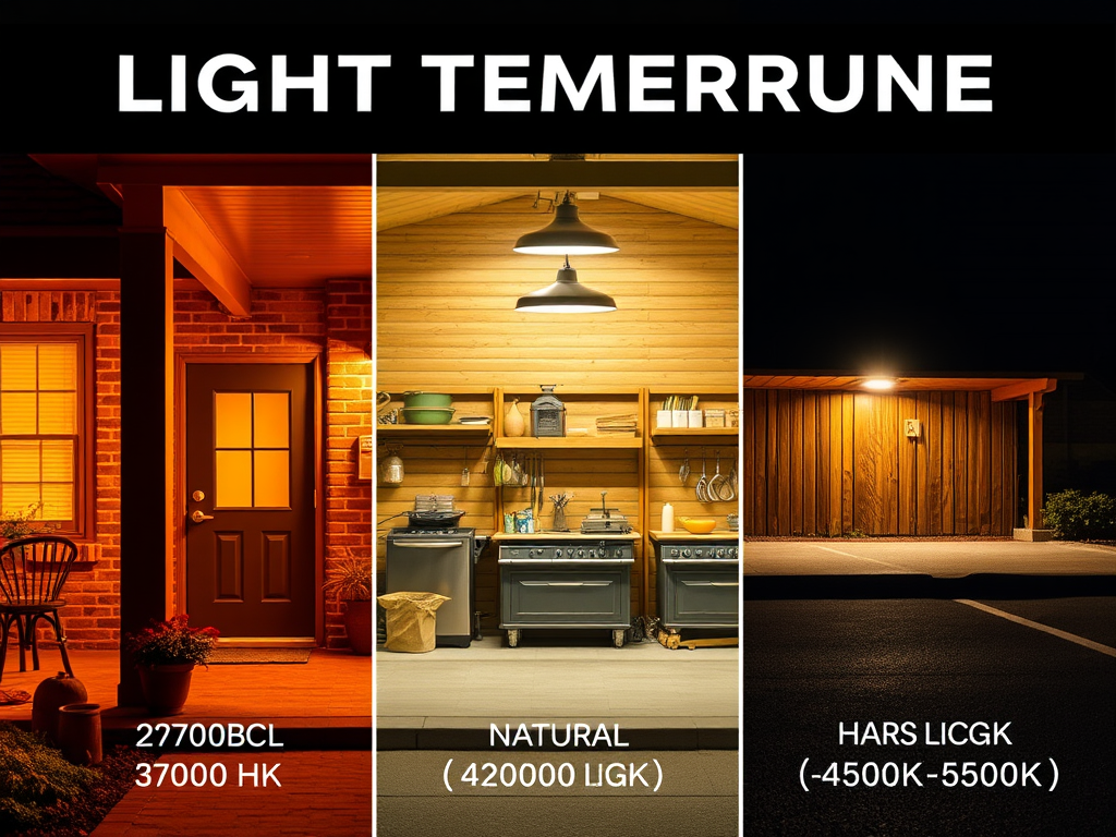
2700K-3000K (Warm White): This is the glow of incandescent bulbs, firelight, and sunset. It’s welcoming, soft, and flattering. Use this for porches, patios, pergolas, and any area meant for relaxation and socializing. It makes architectural textures (brick, stone, wood) look rich and deep. This is “home.”
4000K-4500K (Natural White): A crisp, clean, neutral light. It mimics daylight at noon. This is ideal for task-oriented areas: over grills, at workshop doors, in garages, and for security floodlights where you need clear, accurate color rendition (identifying a face or a package color). It feels alert and efficient.
5000K-6500K (Cool White/Daylight): Harsh, blue-toned, and sterile. This is the light of hospital corridors, big-box store parking lots, and old, cheap LEDs. It creates stark shadows, washes out colors, and feels uninviting. Avoid this for residential settings. It screams “cheap installation” more than any other single factor.
The pro tip: Layer your temperatures. Use 2700K for general ambient wash on your house facade. Use 4000K for targeted motion-activated security spots. The warm light says “welcome,” the neutral light says “I see you clearly.” This layered approach is what professional lighting designers use to create depth, interest, and functionality. Check product specs meticulously; many budget lights default to the cheap-to-manufacture 6500K. Your home’s character depends on this hidden number.